Aug 292012
I was part of a large team at Mobiquity contracted by Fidelity to add some features to their iPad app. We used a scrum-based Agile development process including continuous integration. I was responsible for:
- Login screen
- Tabbed views with data verification (I couldn’t use the standard Apple tabs for aesthetic reasons, nor could I use Container ViewControllers since the app had to run under iOS4
- VerID screen
- Code coverage using Calabash & Cucumber
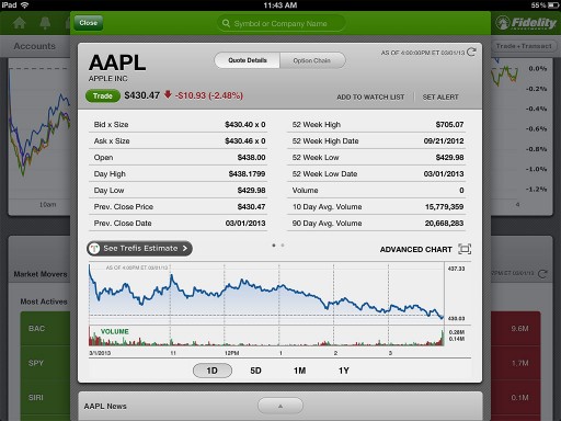
The code had not yet been released by Fidelity so I can’t show it to you. But this screen, from the existing app, demonstrates the visual paradigm that Fidelity uses. You see the floating windows with the green bar, the diagonally striped background and rounded corner boxes with levels of gray shadings. I worked closely with graphic artists to get the screen pixel perfect.

Sorry, the comment form is closed at this time.